We’ve all had to learn to enjoy our home spaces as much as possible. From DIY TikToks to Pinterest board galore, we’ve all run the gamut on home improvement projects. Despite all the different projects and crafts, nothing displays as beautifully as a perfectly styled shelf. In fact, many scientists predict that shelfies are the new selfie and we are 100% on board. Today, we’ll be handing you tips on how to style a shelf to perfection then edit your very first shelfie. Now, grab some books and a potted plant and let’s get ready to shelfie!
1. Use Varying Heights
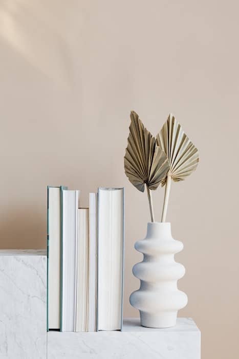
Mix up the height of the objects to keep the eyes moving from piece to piece on your shelfie. Use a combination of taller items and lower profile pieces to add interest.
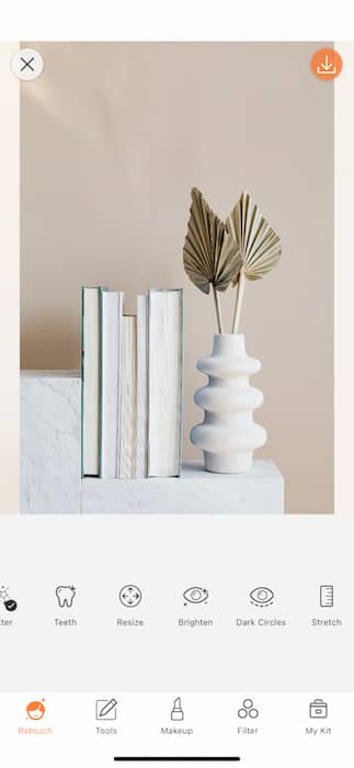
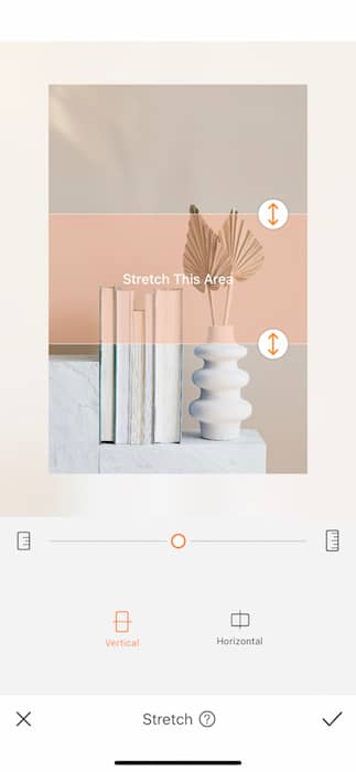
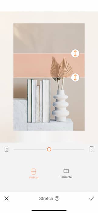
If you find that you’re lacking some height, have no fear, the Stretch Tool is here! Find your Stretch Tool in your Tools Tab. Select the area you’d like to extend. You can choose between Vertical and Horizontal and begin sliding the toggle until you reach your ideal length. Tap the check mark to save your edits.
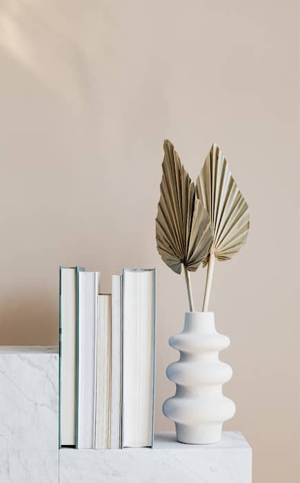
2. Group Items in 3’s
The general rule is to create groupings of three. This is because odd numbers are more aesthetically pleasing when it comes to decor – giving a balanced look without being too symmetrical. The rule of three’s is eternally effective especially when it comes to your shelfie.
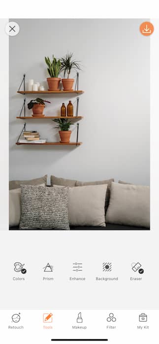
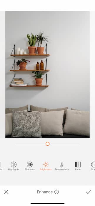
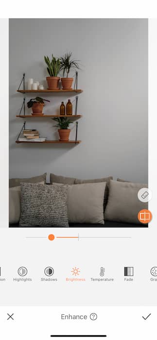
Here you see three shelves with three terra cotta statements. A great way to show off all your grouping work is by playing with shadows. Go to your Enhance Tool found in your Tools Tab and tap on Brightness. From there you’ll darken the image by about 25% or whatever works for your particular image.
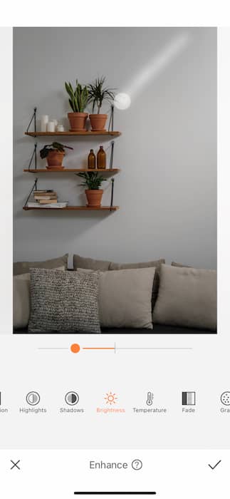
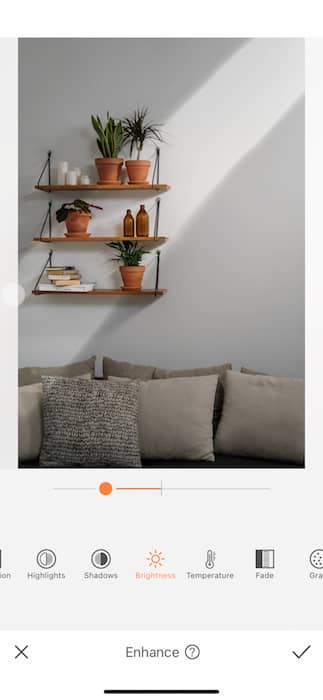
Tap on the white Eraser Icon on the right side. Use your finger to draw out the light in your image. If you feel like you over did it you can find the Pen Icon on the right to redraw the Shadows and start again.
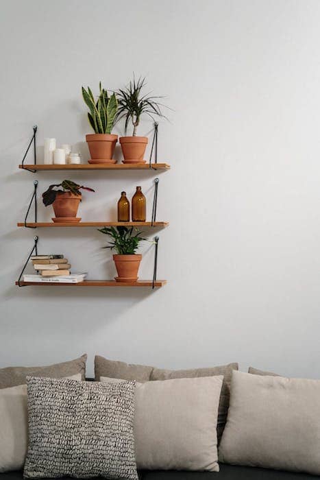
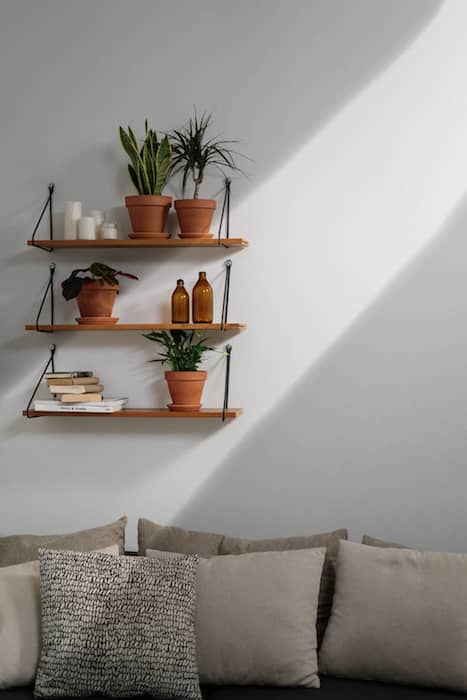
Now that’s some shelfie drama right there.
3. Don’t Forget the Greenery!
If you ever feel like your shelfie is missing something, double check that you’ve added some greenery! Whether it’s real or faux, plants helps liven up the space and keeps it from looking stale. Plants are the easiest way to bring up the mood in any space. Whether you’re an expert #plantparent or an expert #fakeplantparent, a little green always goes a long way.
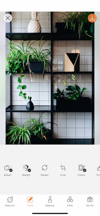
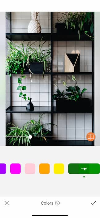
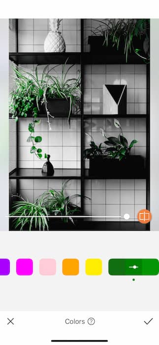
Put some respect on that green with the Colors Tool. Find it on your Tools Tab. Select the green tones and find which of the three levels works best for your image. You can work with Shadows, Highlights, & Midtones. Use the toggle to adjust the strength of the tool and make sure those deliciously green leaves are taking center stage. Make sure to tap that check mark to save your edits.
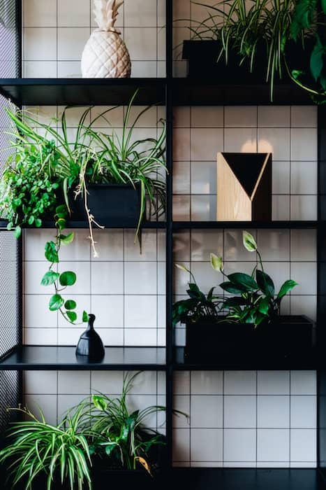
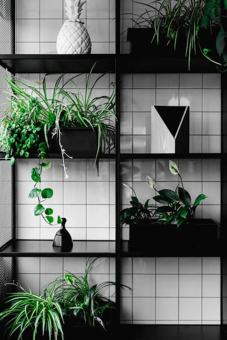
Just like that you’ve got yourself a perfectly styled shelfie. Be one of the first on the shelfie scene with these easy tips and you’ll be dominating the interior design space before you can even say Bauhaus. Don’t forget your little friends here at AirBrush and make sure to tag us on your next interior design flex! Use the hashtag #AirBrushApp (and #shelfie) for a chance to be featured on the @AirBrushOfficial instagram page and while you’re at it give us a follow for more special tips, hacks, and even giveaways. Happy shelfie-ing!


