In past years, flat lay photography has taken over and appeared everywhere. Whether it’s on social networks, magazines, or advertisements, flat lays are ideal to deliver a very clear message captured in a single glance. Fun and versatile, you can use anything and everything in your flat lay allowing your imagination to roam freely.
But, what’s a better photography subject than your everyday life? Flat lays are ideal when it comes to your routine. A day at work gives you the opportunity to create a stylish desk picture – while cooking dinner allows you to produce a colorful and tasty picture. Even a chill night in front of the TV can craft a very comfy flat lay!
What’s a Flat lay?
Technically speaking, a flat lay is an image taken straight down from above. But what makes a great flat lay is its composition. Styling your flat lay is what will make the difference. Tempted to try one? Here are tips to pull off the perfect flat way:
Know your composition
In flat lay, two major elements are important in the picture’s composition; the primary prop and the secondary ones. Basically, your ‘main’ product and the ones surrounding it. The secondary props usually are linked to the main product in either the same theme or color. These surrounding items are here to add context and fill the gaps of your picture without stealing your main’s prop spotlights.
First, place your main product and add your secondary items around it. Try different angles and positions to see what looks best for your whole composition.
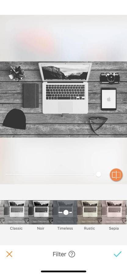
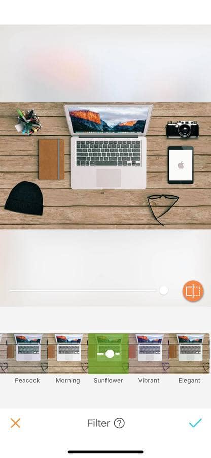
The quick edit: Use the Filter feature to either create a cold or warm-toned picture. This will give you two different atmospheres to choose from.






Distance, layers, and depth
Knowing your composition is one thing, where and how you place your props on your flat way is another. And this is what will make or break your composition. While styling your picture, take the distance between objects into account and balance it out. Some items work better with more space, while others look best in a group. The only way to know what looks best is to keep moving the objects while having your eye through the camera lens until you find the right composition.
Another way to balance your photo is by adding extra depth and layers to your picture. To do this, simply add props on the top of each other while keeping the bottom ones stay visible. This new ‘volume’ will help in creating a storytelling effect to your image that will keep the viewer interested.



Pro tip: Remember, just because you are creating a flat lay doesn’t mean you can’t have ‘standing up’ objects!
Choose the right background
The point of the background in this kind of photography is to play the role of the canvas. Try to use mate and neutral-colored backgrounds. It is preferable to avoid busy pattern backgrounds as they are distracting the viewer’s eye. But don’t worry these backgrounds are easy to find in your house: a wooden table, white bedsheets, or a marble or granite countertop are ideal for flat lay!




Keep the same color palette
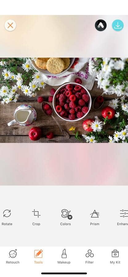
Staying in the same color tone is another way to create a great flat lay. Simply, stick to 2 or 3 colors that blend well together and let the magic happen. For ‘flashier’ colors use a white or black background to make them pop even more!
The quick edit: Use the Colors feature to make your palette pop, creating unique flat lays.



Create movement
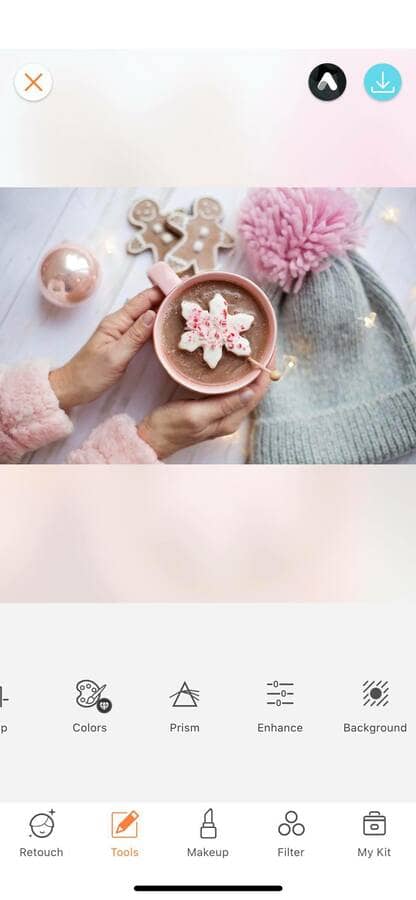
If you want to create some action in your flat lay, add an extra pair of hands to your picture. By adding a person, you will produce a sense of movement and life in your photo.
The quick edit: Use the Grain option of the Enhance tool for a vintage flat lay look.

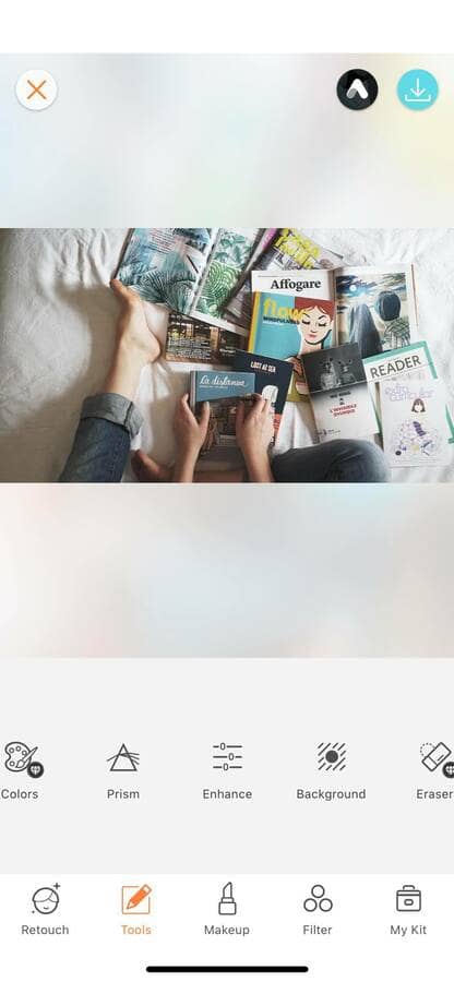

Flat lays are incredibly fun to make and create amazing pictures. And what’s better than the AirBrush app to edit them? Now that you have our tips to make the perfect flat lay, we want to see them pop up on your Instagram feed. Make sure to tag us with the hashtag #AirBrushApp and get a chance to be featured on our official page @AirBrushOfficial.


